HD Supply
+ Creative Direction + UI Design
The customers at the HD Supply website can shop, search, and solve maintenance, repair, and operations needs. Whether ordering supplies or tackling maintenance tasks, one might get overwhelmed by an expansive offering of products and services.

The card-based approach on the product list page is to create a more organized and clutter-free experience due to the number of variables relevant to each product. I designed the page with horizontally aligned filters so users can easily narrow down the vast product catalog and quickly add to their cart directly from the page. Rather than showing all the information by default, each product card can be expanded to reveal details which makes the visual elements less distracting.


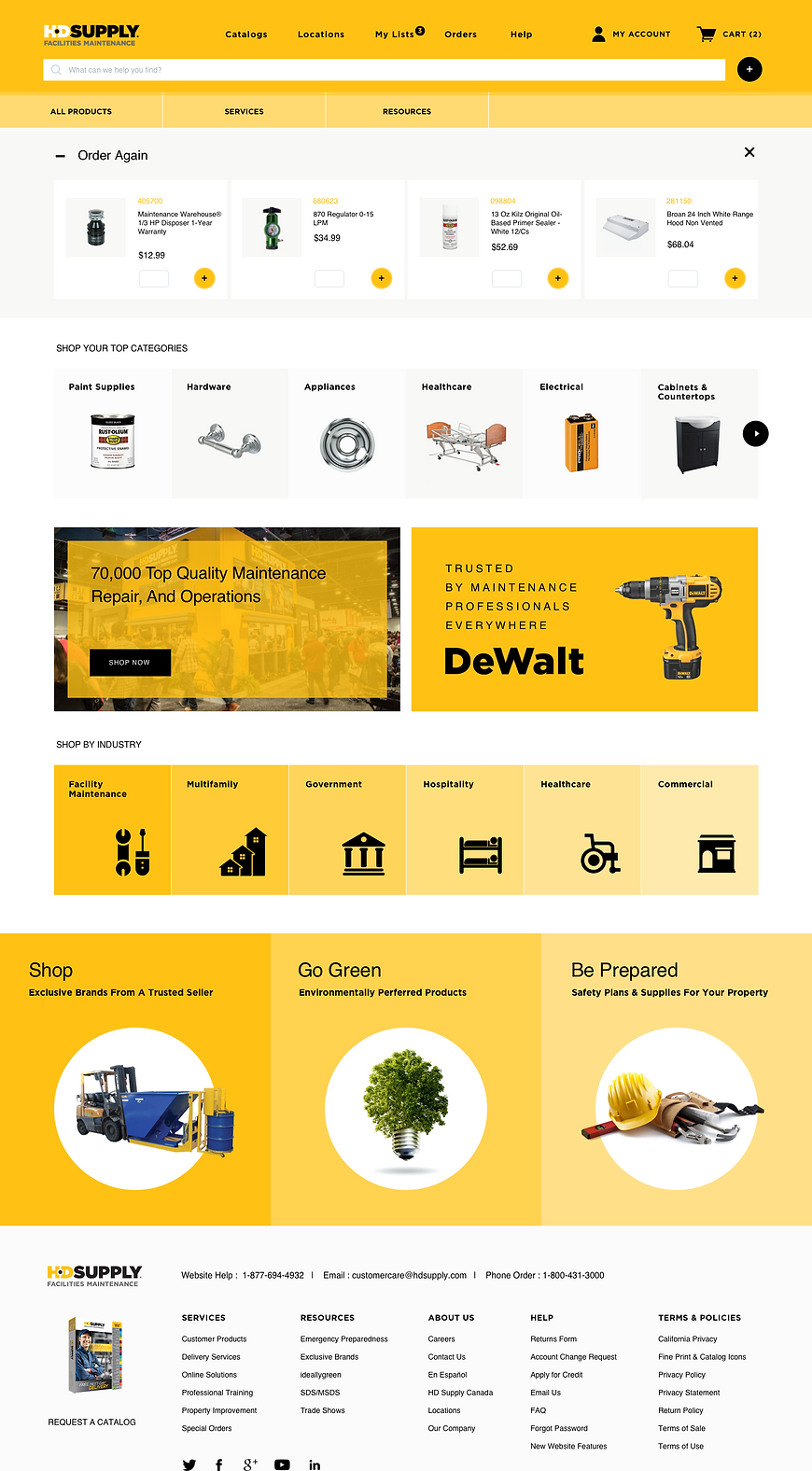
The hero space showcases new and featured products with their forms and texture to make the hardware, often considered dull objects, look more attractive and visually appealing. Featured brands and stories about some products are curated on the editorial page which will help the users learn and access the information quickly.


In this direction, the design elements bring beauty and fun to simple, bold geometric shapes with a modern, utilitarian look and feel. Simple UI leads with HD Supply's yellow brand color illuminating the collection.
At the top of the page, I included the "Order Again" section, especially for returning companies or institutions, to help them save time and be more efficient. The "My List" page is also for quick and accurate reordering, which helps the users see their saved products at a glance.


